If you’ve added an “Image Gallery” element to your page/post/theme template and want to use the “Carousel” gallery type, this article will show and explain how you can use all of its specific options.
If you need to find out how you can use the “Image Gallery” options, you can find them described in this article.
To choose the “Carousel” gallery type, click on it, from the “Gallery type” section of the “Image Gallery” options:
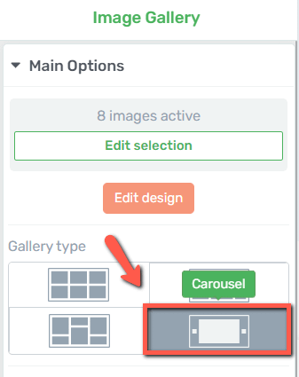
The options will appear below the section:
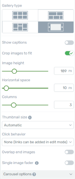
If you want to know how to use the first set of options, please check out the “Image Gallery” article, as they are explained individually.
In this article, we will only tackle the options that are specific to the “Carousel” gallery type:
Overlap end images
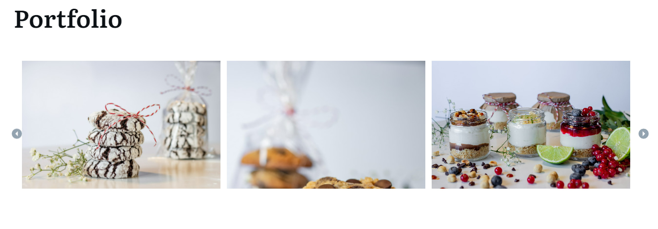
If activated, this option will include part of the previous and next set of images from the carousel. For example, here is what the element looks like if the option is not enabled:
And you can compare it to what the element looks like with the option switched on:

If you want to activate this option, click on this switch:
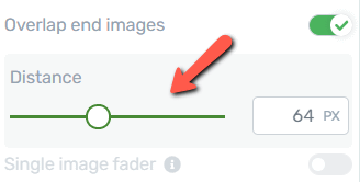
If you do that, you will be able to choose the distance/dimension of the end images, by dragging this slider from side to side, or using the field next to it to enter a numerical value:
Single Image Fader
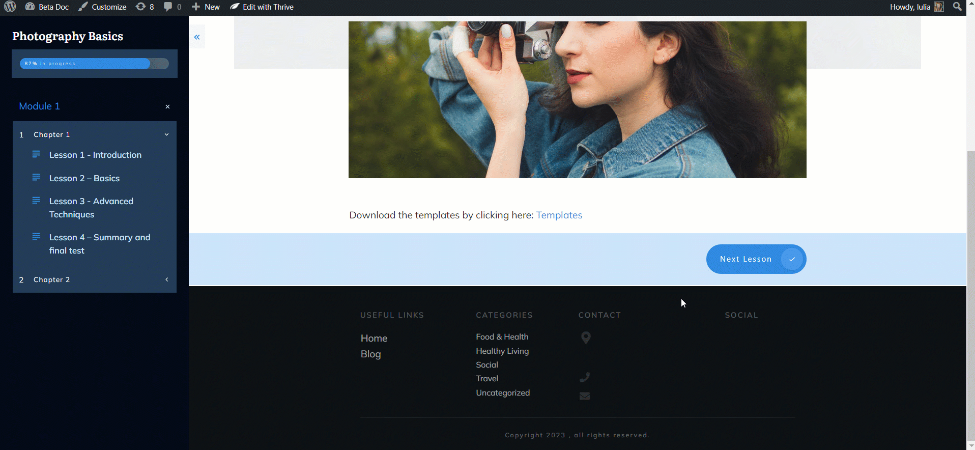
If you activate this one, the gallery will be displayed in the form of a single image per slide, and a fading transition will be added, as seen here:
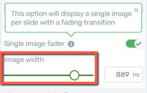
You will be able to change the image width if you decide to enable this option:
Right below this option, you will find one more set of options, that are specific to the “Carousel” image gallery type. Click on the down arrow next to the “Carousel options” section, to expand it:
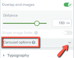
Carousel Options
Here is how to use all of the options found under this section:
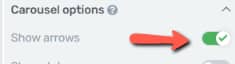
Show arrows
The first available option here is the “Show arrows” one, which will allow you to add or remove the left and right arrows for the gallery:
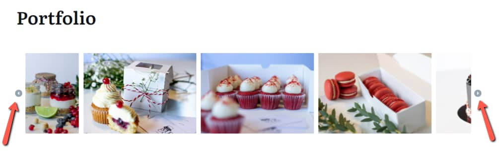
If you want to include the arrows, thus allowing the visitors of your site to browse through the images using them, make sure this option is switched on:
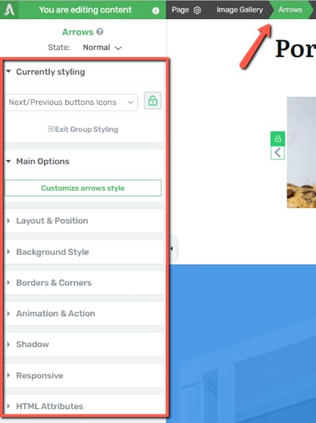
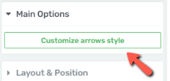
The arrows can be customized to your liking. If you want to do that, click on one of the arrows, to select it:
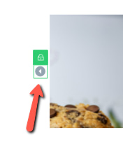
The options that you can use to modify and customize the arrows will appear in the left sidebar:
-
Currently Styling
Group styling is enabled when editing the arrows, but you can unlink them and edit each arrow, one by one. If you want to do that, select one of the arrows, click on the lock icon, to unlink it from the other one, and customize it as you wish:

-
Main Options
Then, you have the “Main Options” section, from where you can customize the style of the arrows. Click on this option, to access all of the options available here:
You will be able to change the icon and its style:
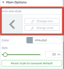
To change one of the other, all you have to do is click on the desired option, and use the pop-ups that open to choose the icon or style:
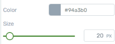
And after that, you can change the icon color and size, using these two fields:
Moreover, if you ever want to go back to the default look of the arrows, you can use the “Reset style to carousel default” option:
-
General Options
You can also use the rest of the general options, such as “Layout & Position”, “Background Style”, etc. to further customize the next/previous arrows. For each of these options, you can find separate articles in our knowledge base.
-
“Hover” state
Additionally, you can edit the way the arrows look when someone hovers their mouse over them. For that, click on the “State: Normal” section of the left sidebar and choose the “Hover” state:
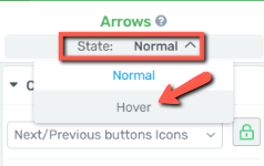
Use the options from the left sidebar to customize the “Hover” state, and, when finished, you can go back to editing the “Normal” state.
Show dots
Next, you can also decide whether the dots below the gallery are visible or not. These dots will be in sync with the number of images that are added to this element, and you can also use them to navigate through the images:
If you want them displayed, switch this toggle on:
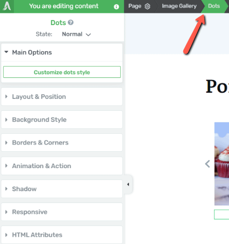
Similar to the next/previous arrows, you can customize the appearance of these dots. For that, click on them, so that you will select them:

Once you do that, the options of the “Dots” element will appear in the left sidebar and will be available for you to use:
-
Main Options
The “Main Options” section will let you customize the icon, style, color, size, as well as the horizontal space in between the dots:
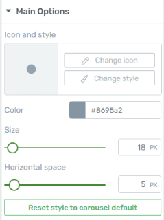
Here, too, you are able to reset the “Dots” element in order to go back to its initial look.
-
General Options
Here, too, the rest of the general options can be used to customize the “Dots” element further. For each of these options, you can find separate articles in our knowledge base.
-
“Hover” State
To modify the “Hover” state of the “Dots”, select it, from the top side of the left sidebar:
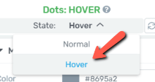
Modify this state as you wish, and then go back to the “Normal” state.
Slides to scroll
Coming back to the “Carousel options”, the next one will be the “Slides to scroll” option:
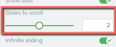
This will allow you to set the number of slides to be scrolled. You can either use the slider, to change the value, or enter a numerical value from 1 to 3 in the field next to the slider.
Infinite sliding
When this option is switched on, it means that, when someone slides through the images and reaches the last one, the slide will start from the beginning, and thus creating an infinite loop:
If the option is switched off, when the gallery reaches the final image, the sliding will end.
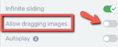
Allow dragging images
The “Allow dragging images” option will let the users click and press the images from the carousel, to drag them around:
If you do not want to allow users to do this, leave this toggle switched off:
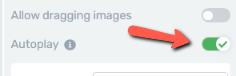
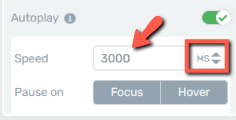
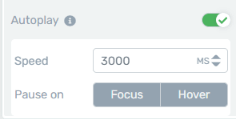
Autoplay
Lastly, you can use the “Autoplay” option, to have the carousel automatically scroll through the selected images of the “Image Gallery” element.
To enable it, make sure this toggle is switched on:
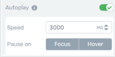
And if you do decide to turn on the “Autoplay” feature, two more fields will appear below it:
-
Speed
You are able to choose the “Speed”, meaning the time that will pass in between changing images.
The default value will be set to 3000 milliseconds, but you can change it to the desired one by using the up/down arrows, or by entering a numerical value in this field:
-
Pause On
Lastly, you can choose when the autoplay should pause. The two available options are “Focus” and “Hover”.
You can choose one or the other, or both. If you choose “Focus”, the play process will be paused when an image is clicked on, and the “Hover” option will have the autoplay paused when someone hovers the mouse over one of the images.
Click on the option/s you prefer:
These are the options that are specific to the “Carousel” Image Gallery type.
You might also be interested in this article, in which we show an interesting way as an example of using the carousel “Image Gallery”.
Hopefully, this article was useful to you. Don’t forget to check out our entire knowledge base, if you need help with any other Thrive Architect elements or features.
Be sure to also leave a smile below, if you found this article helpful 😄