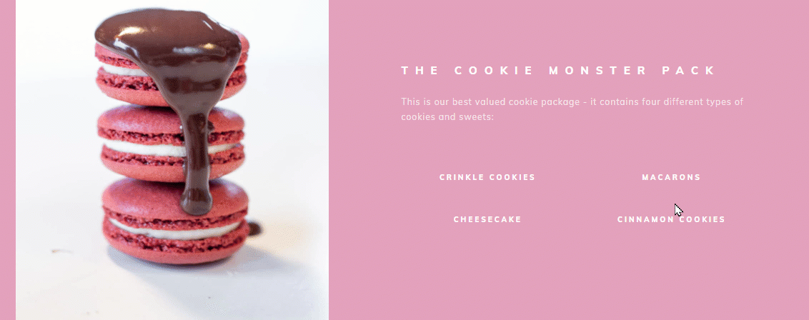
Tooltips are a great way to ensure that the visitors and users of your site are aware of all of the features and options your website provides, or just to generally sprinkle more information site-wide.
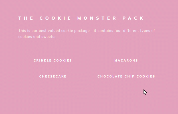
These are basically some rectangular speech boxes that can provide additional information to a certain item, when someone hovers their cursor over it:
Adding tooltips can be easily implemented in Thrive Architect. If you want to achieve this, make sure you follow these steps:
1. Add a new/ select an existing “Content Box” element
The “Tooltip” option comes as a feature for the “Hover” state of the “Content Box” element. Therefore, the element for which you want to add the tooltip has to be inserted inside a “Content Box” element.
The way to add and customize this element is described in more details here, so make sure to read this article, as well.
You can easily add a new “Content Box” element, using the plus sign from the right sidebar, looking for the element, and using the drag and drop method to place it on the editor:
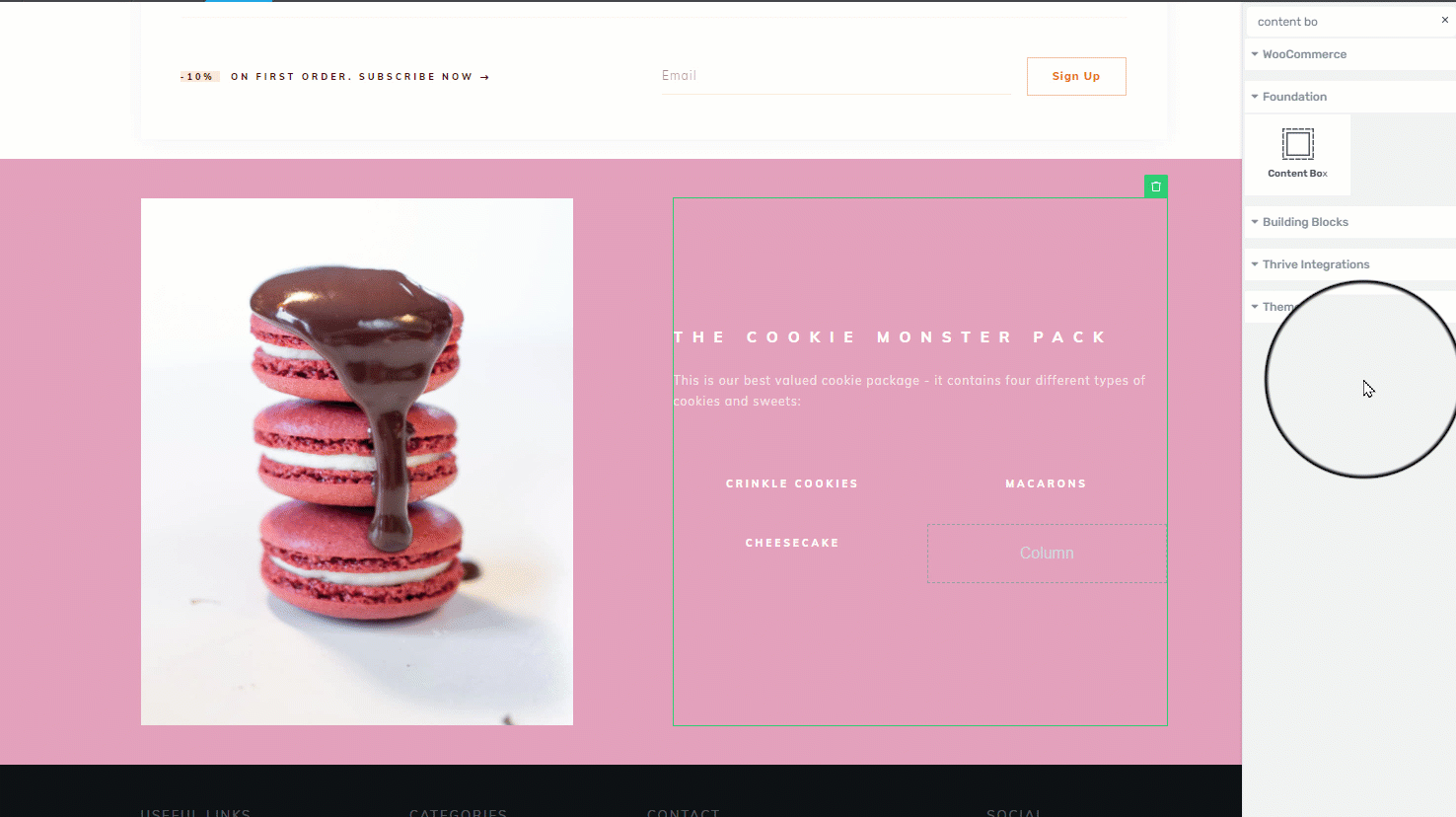
Inside this “Content Box” element, you can then place the element for which you wish to add a tooltip. This can be any element you want, from our element list (“Text”, “Image”, “Button”, etc.
In my example, I will be using a “Text” element, but you can use whichever element you want. The only trick is to add it inside a “Content Box” element.
2. Edit the “Hover” state of the “Content Box” element
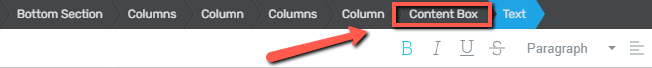
Once you’ve placed the desired element, select the “Content Box” element (you can use the breadcrumbs to do that):
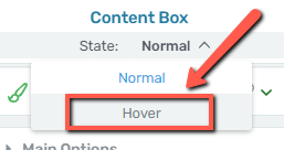
The options of this element will appear in the left sidebar. From the top side of the left sidebar, click on the down arrow, next to “State: Normal”:
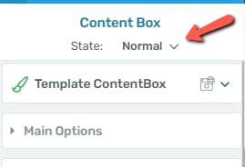
A small dropdown will open, with the two states that are available for the “Content Box” element. Click on “Hover”:
3. Use the “Animation & Action” section to add a tooltip in the “Hover” state
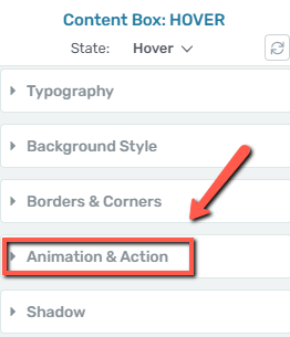
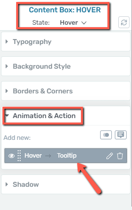
When choosing “Hover” from the dropdown, the sidebar will be left with fewer sections of options, only with the ones that can be used for this state in particular.
One of the sections here will be the “Animation & Actions” section, and this is where we can add the tooltip from:
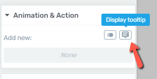
When you expand the section, you will notice that you can either add a CSS animation, or you can display a tooltip. Naturally, the second option is the one we’re going to use:
4. Add and customize the tooltip
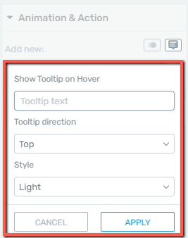
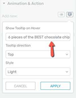
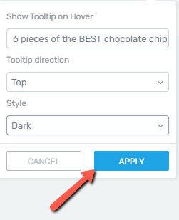
If you click on the “Display tooltip” option, this pop-up will open:
-
Tooltip Text
In the first field, insert the text to be shown in the tooltip:
-
Tooltip Direction
The next option will allow you to choose the direction from where the tooltip should appear. Click on this field, to open the list of options:
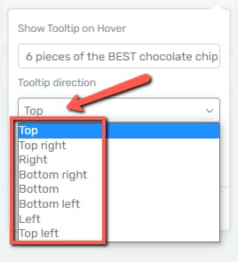
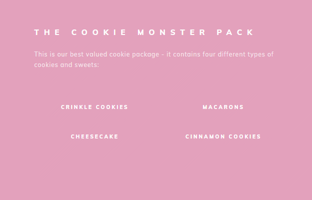
You can test all of them out, to see which direction best fits the design you have in mind. For example, this tooltip has been set to appear from the top:

And this one from the bottom:
-
Style
You can also choose the style of the tooltip – light or dark:
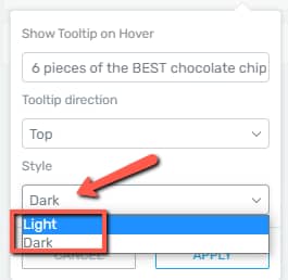
A “Light” tooltip will look like this:

Whereas a “Dark” one will look like this:
Choose the style that you like, and then click on “Apply”:
Once applied, save everything. The tooltip will be visible on your site, whenever someone hovers the cursor over it.
5. Edit or remove the tooltip
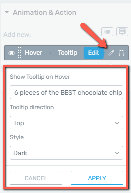
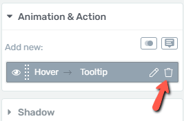
If you ever want to come back and edit or delete a tooltip, you can do that. You will find the tooltips listed in the “Animation & Action” section of the “Hover” state options:
If you want to edit the tooltip, simply click on the pencil icon, and the pop-up will re-open, allowing you to change the text/direction or style:
If you are looking to delete the tooltip, you can do that by clicking on the trash can icon, here:
|
Note: Please keep in mind that, while you are not able to add more tooltips to the same “Content Box” element (in the “Hover” state), you can add two different animations/actions to it. For example, you can have a “Content Box” that has both a tooltip and a CSS animation applied to it:  You can do this to emphasize the element on which the cursor is placed, and also show more details, via the tooltip. This is what it will look like on the website:  |
This is how you can add and customize tooltips, when using Thrive Suite.
I really hope this article was helpful. If you need more information about our products and how to use them, please make sure to check out the rest of the articles and tutorials from our knowledge base, here.
Also, don’t forget to leave a smile below, if you’ve found the article useful. 😄