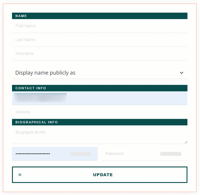
The “User Profile” element can help you create self-managed profile pages, thus allowing the users of your website to customize their profile directly from one of your pages.
This article will guide you through the process of adding the element, customizing it, and understanding how to use its options.
Add the Element to the Post/Page
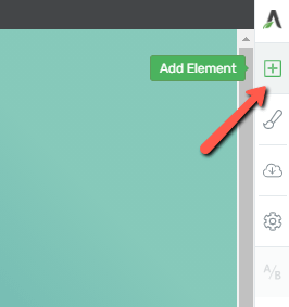
In order to start using the element, you’ll first need to add it to your page, by clicking on the plus sign from the right sidebar:
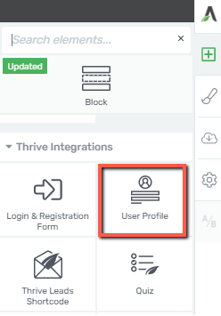
Look for it within the available list of elements (under the Thrive Integrations section), or you can simply type the name in the search field:
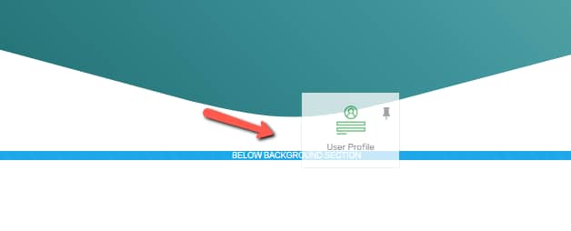
Grab the element and drag and drop it to your page or post:
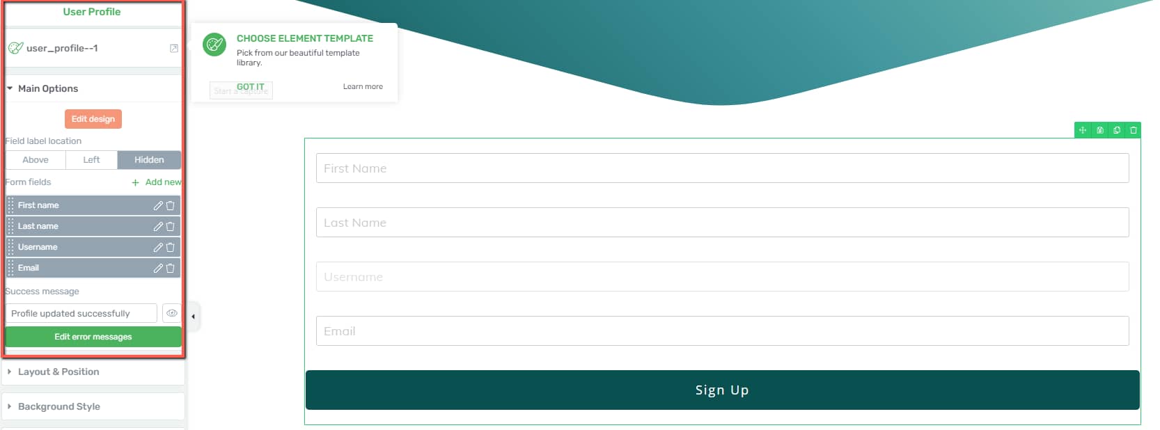
Once the element has been added to your page, the main options will appear in the left sidebar:
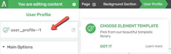
Choose the Template
The first section available in the left sidebar is the one allowing you to change the template of the element:
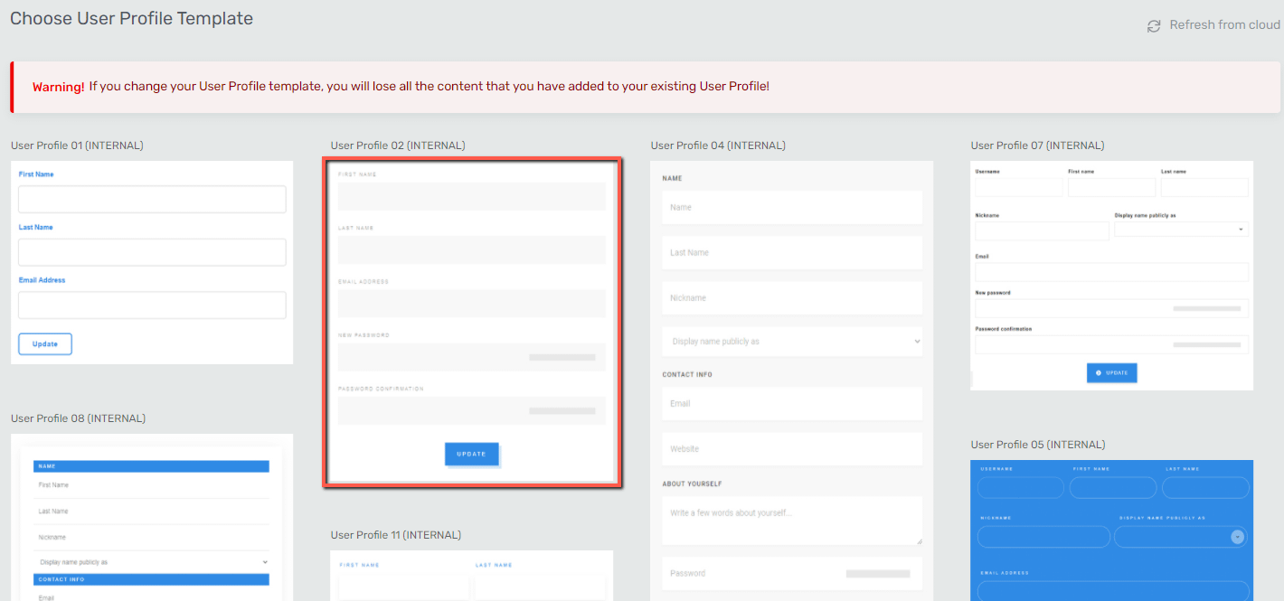
When you add the element to your page, it will automatically load a template from the library, but you can change it anytime you want from the above-mentioned section.
Just click on it, and it will instantly take you to the lightbox with all available templates you can choose from:
Use the Main Options
You can next proceed with customizing the element as you best see fit:

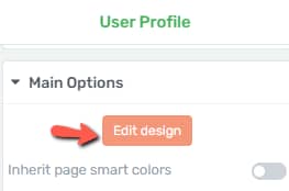
Edit Design
The first thing you can do in the “Main Options” sidebar is to customize the design of the icons by clicking on the “Edit Design” button:
This will open another set of options in the sidebar:
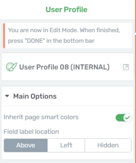
You can use the “Inherit page smart colors” toggle if you want your template to match the colors of your page theme or template, and you can also decide the location of the label by using one of the three available options. Both options are described in more detail in the “Main Options” section of this article.
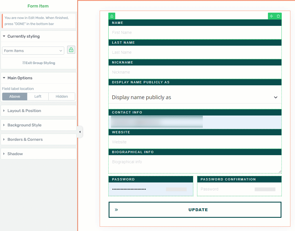
Hover over different parts of the element to see all the items you can edit:
Once you click on one of the items, its options will appear in the left sidebar, allowing you to bring whatever changes you want to it.
You can change the form items, labels, inputs, the buttons, and text existing in the selected template as well as their location within the form (you can grab them and arrange them in a new order).
Note: the items you can edit here might vary, depending on what template you have chosen for your element. Each template has a different design, hence the labels, buttons, fields will be different from case to case.
Currently Styling
The “Form Items”, “Form Inputs” and “Form Labels” can be edited using the “Currently Styling” feature:
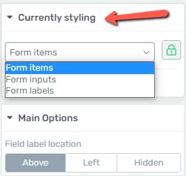
This means that any change you make will be applied to all items of the same type. So if you want to customize all the existing “Form items”, select one “Form Item” and then use the options available in the left sidebar:
However, should you wish to edit each “Form Item” individually you just have to select the one you want to apply the change to, and then click on the lock option which will automatically turn red:
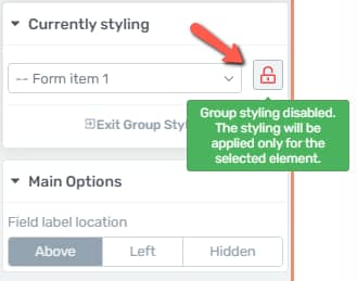
This is an indicator of the fact that the group styling has been disabled, and that the styling will only be applied to the selected item.
Another thing you can customize while in the “Edit Design” mode is the “Dropdown field”:
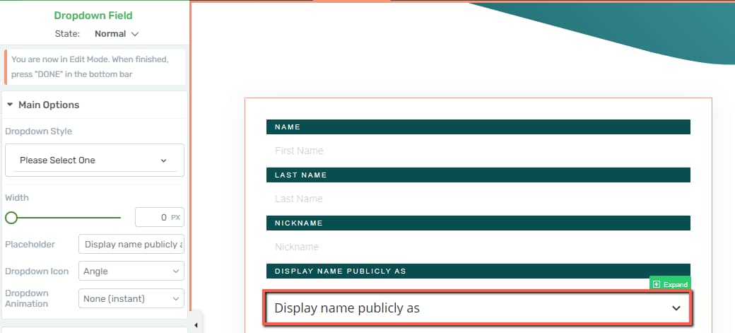
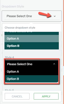
You will notice that there are several options in the left sidebar you can use. You can change the “Dropdown Style”:
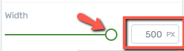
You can change the “Width” of the drop-down, by using the slider or by inserting a numerical value in the field next to the slider:
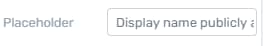
If you want your drop-down to display a different text, use the “Placeholder” field to change the currently existing text:
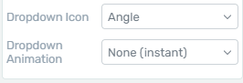
And lastly, you can also use these two fields to change the icon and animation of the drop-down:
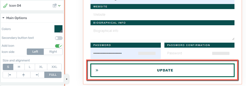
You can also change the button if you want and use the options just as in the case of any other “Button” element:
When you have finished with editing the element and want to exit the “Edit Design” mode, click on one of the two “Done” buttons located in the bottom part of the page:
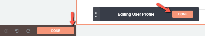
This will take you back to the “Main Options” of the element:
Inherit page smart colors
The next available option from the left sidebar is the one allowing you to change the color of the element.
If you’re using a Landing Page, or Thrive Theme Builder theme, the color of the element can be inherited either from the Thrive Theme Builder template or from the Landing Page:

You can read more about what are smart colors and theme colors in these two articles linked below:
If you don’t want to use your template or theme color, simply deactivate the toggle and this will trigger the color field:
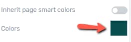
Clicking on it will take you to the color picker, where you can manually change the color or insert a HEX / RGB code in the corresponding field:
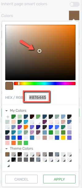
You can also choose one of the already existing colors from the “My Colors” and “Theme Colors” sections. Once done, click on “Apply”.
Field label location
Change the field location using one of the three available options:
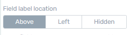
The “Above” and “Left” options will change the position of the field, and if you don’t want to display the label at all simply select the third option, “Hidden”.
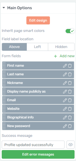
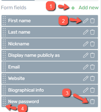
Form fields
In this section of the left sidebar you are able to view the full list of fields available in the template you have selected for your element:
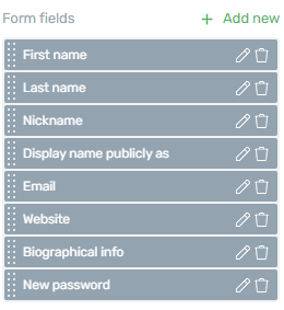
You can (1) add new ones if you want, as well as (2) edit, (3) remove, or (4) move around the currently existing ones:
Whether you are trying to add a new field or edit a currently existing one, the options will be the same:
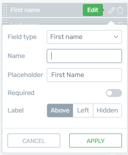
You can select the field type, name, and placeholder, as well as decide whether you want to make it mandatory by using the “Required” toggle.
Also, just as in the case of the already explained field labels, you can use the options available in this pop-up to change the location of the label.
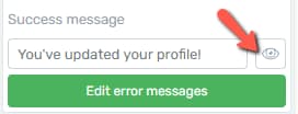
Success message
Use this field to change the message that will be displayed once someone fills in the form and submits it:
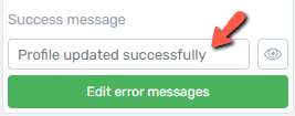
Erase the text and add the one you want, and click on the “eye” icon to preview it:
Edit error messages
You can also change the error message text if you want:
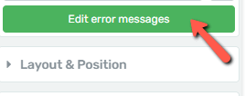
This will trigger a lightbox from where you can customize the error messages that will be displayed in various instances, as shown below:

Don’t forget to “Save” your changes when done.
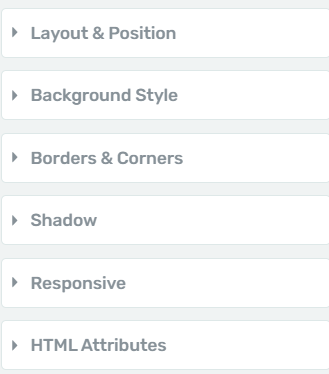
Use the Rest of the Options
Just like in the case of other elements, besides the “Main Options”, you can use some other general options, as well (such as Layout&Position, Borders&Corners, etc.):
Make sure to take a look at the articles and tutorials from our knowledge base if you want to read about what each option does.
You might also be interested in this article, which shows one of the ways you can integrate this element on your website.
Hopefully, this article about how to use the “User Profile” element was useful to you.